If you are in the business of online marketing, then conversion rates are a term you should know well. Conversion rate optimization (CRO) refers to all procedures and techniques used to increase website conversions. You might wonder what factors contribute to CRO? The answer is UX, usability, brand trustworthiness, and relevance. To ensure your investment in CRO pays off in the long run for your business, it is important to have a step-by-step strategy that delivers results and does not require too much time or money to do it.
In this article, I will give you 10 steps for effective Conversion Rate Optimization that increase conversions without costing an arm and leg!
If you are a UX designer or marketer who is tasked with boosting conversion rate on your website or landing page, but are not sure where to start, here is the perfect place. How do I boost the conversion rate? Everything starts with defining measurable goals for your site, before assessing visitor behavior against these defined goals. Once this is done, it becomes easier to create something that will help convert visitors across the board.
When I check websites or a landing page, people love to tell me their main business goal. The most important measure they want to take on their site is usually the key to a high ranking in Google or a high conversion rate!
I ask them this question, because if we do not know what our goals are, there is no way to evaluate a website or sales page against something specific. If you tell me your goal is "to have potential customers read about products," I am sorry, but that is not tangible. It does not provide any information on how effective a campaign is, or where we need to focus to increase that conversion rate. So remember - always have clear goals in mind for conversion rate optimization.
Without data, you will not increase the conversion rate on your website. Many UX designers and marketers start with assumptions or estimates, but that is a big mistake. It is important to constantly monitor and analyze your website data to learn more about your potential customers, so that you can better direct conversion rate optimization efforts.
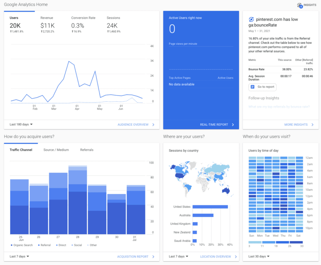
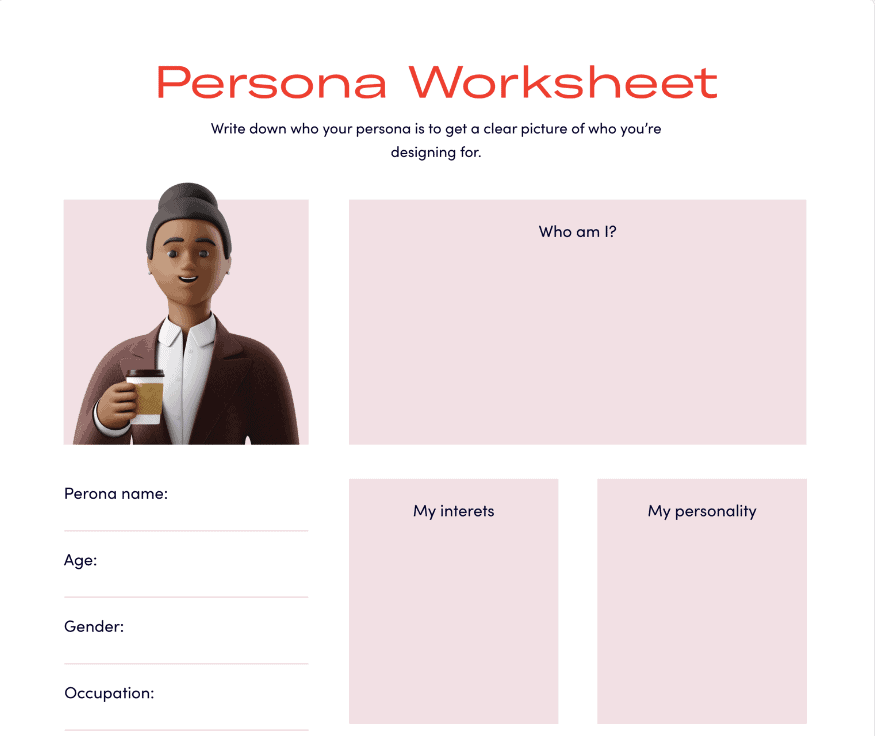
If you have collected quantifiable data from these areas about your existing customers, it is time to create an online persona of your ideal user. This representation contains all valuable information that will help conversion optimization campaigns be more effective and increase the conversion rate on the website, as well as testing various design options for usability problems on the website.
You know how competitive the world is nowadays. It is important to keep one step ahead of your competitors, including understanding what they are doing in terms of conversion rate optimization. One way to do that? Competitor analysis! Instead of simply looking at their ecommerce website for inspiration or ideas on where to improve your website's conversion rate, analyze them - analyze all aspects from UX design to marketing techniques like email marketing campaigns and what they write about in the latest blog post. This gives you a clear idea and an edge over your competitors.
A value proposition is the one sentence that describes what a company does, who it's for and why they should care. It's also called a promise statement or "elevator pitch". A compelling and clear value proposition can help companies succeed in marketing their products by giving potential customers a reason to choose them over other brands when opening your landing page.
In the old days, when sales happened through phone or in person, a persuasive value proposition was crucial. The moment you had to convince someone that your product was worth buying and not comparable alternatives from other brands, you have to articulate what makes it stand out. Your value proposition forces clarity of thought and essential facts about your brand into a concise sentence! But this applies as much today as on the phone 50 years ago when it comes to conversion optimization. If you have a value proposition for the user when they get to decision-making, it could be what convinces them to click on that buy button!
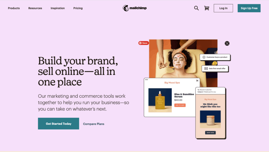
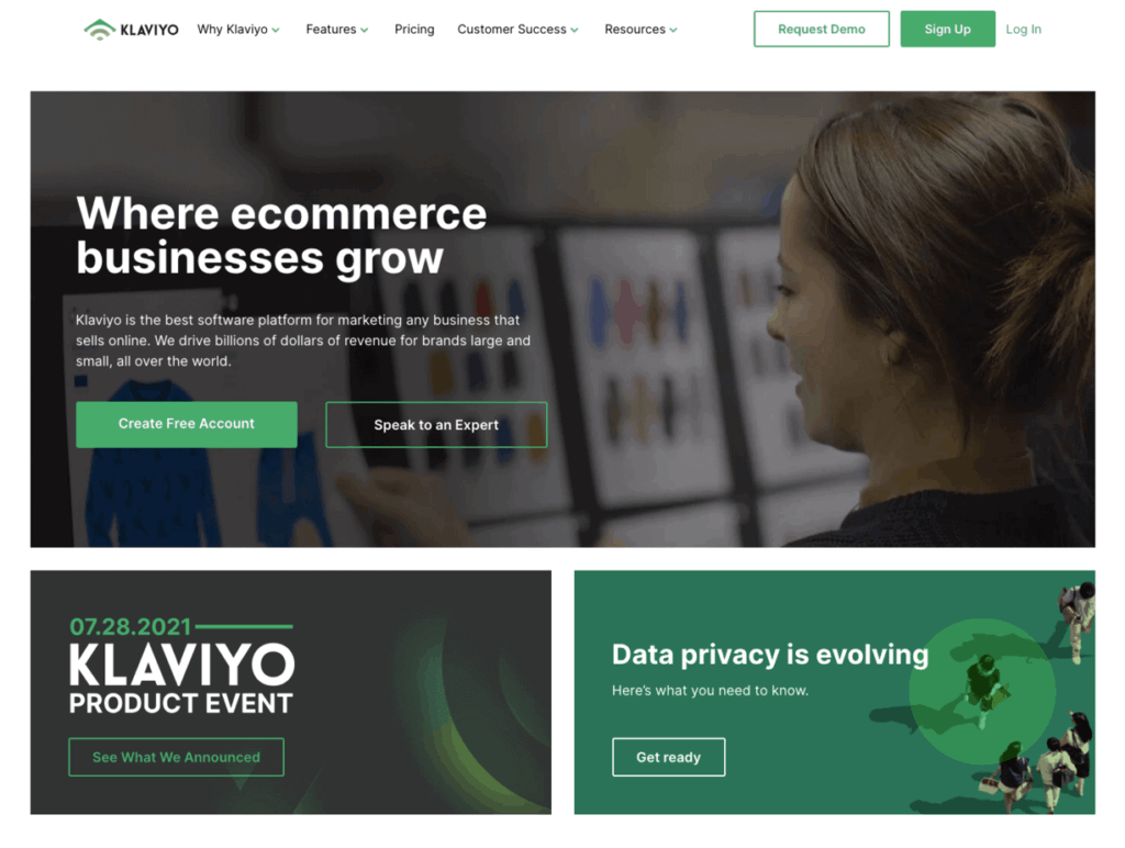
It is best to use sales funnels if you want the customer to feel more comfortable and better understand what they are buying. This is crucial for expensive and complicated products. For example, if you have a software product, instead of asking for the sale immediately after you have shown your demo or free trial version, it may be more effective to offer an email course on how to use the product. This will help build trust and prove you are knowledgeable in this area.
You can also create sales funnels by creating different price tiers. For example, if you have an online knitting course and your student wants to buy the premium plan for $100 / month, it might be better to offer a free trial first, then a basic package at a lower price ($25), then one with more features but less frequent access (for $500) before finally offering the premium package.
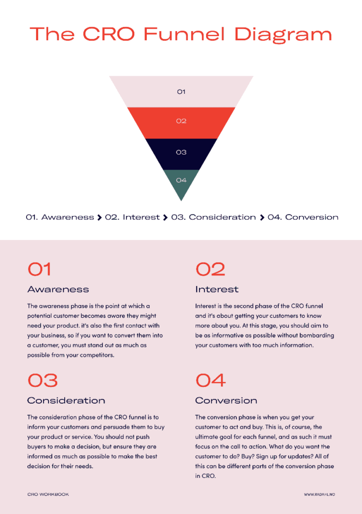
It is important to find the balance between what you want to achieve (the conversion) and what the visitor wants. This can be done by offering free content and other valuable content on your topic, like blogs and white papers, to build trust.
The visitor will want to know that they can trust you with their money before giving it to you. They may not be interested in your product immediately, so don't pressure them or offer too much immediately. Give them time and show them how valuable the content is first. Once the relationship has been established (through email drip campaigns), you can ask for the sale.
It is important to build that trust over time, and some even say you have to contact a potential buyer 6 times before they are likely to buy from you.
So take your time and don't pressure the potential buyer, because this can lead them away instead of making a purchase. Offer value before you ask for the sale. Start by simply capturing their email address so you can continue to talk to them and bring them closer to buying something from you in the future.
A conversion funnel is when a user finds the product they want to buy, and then decides whether to buy it. This is typically done through a series of steps, in which some users are more inclined than others to take the next step.
For those with low interest in taking the next step, you can increase the conversion rate by figuring out what would make them more inclined to do so. Some good examples include simplifying your checkout process or giving reasons to buy now (e.g. a "limited-time offer").
When assessing your conversion funnel, it is best to identify the point at which people are likely to abandon their purchase. This can be found by analyzing data from tools like Google Analytics and Hotjar, or other methods of tracking and identifying drop-offs at each stage of a user journey. Most of the time, this will happen at the cart (due to financial commitment), so it is important to increase your conversion rate at this stage.
An average of 69% of those who go through the checkout process will abandon their carts. It is not always clear how many people who abandon their carts will actually return, but a boost in your conversion rate, even a little, can make a huge difference. One of the easiest things to do is, for example, offer free shipping to your clients.
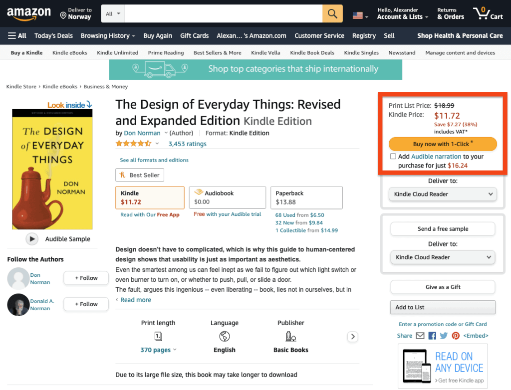
Amazon provides an example of how simplifying the checkout process can boost conversions: its one-click checkout systems are designed to make this part of the purchasing process easier and quicker for customers. They have figured out which steps lead to higher conversion rates, and created an interface that eliminates unnecessary steps.
If your conversion rates do not improve, you will have to make some changes to the website. You should consider investing in high-converting page design strategies based on a deep understanding of how people use websites and what they respond most positively to. Tools like heap.io, scroll length, mouse tracking, and heat maps can help give insight into visitor behavior, as they are specifically related to the layout or user interface of an individual website. Armed with this information, you will be able to create pages visitors are more likely to find engaging.
A satisfying customer experience can lead to an increase in sales. By doing things like ensuring that you dispel any concerns your customers have, so that they are confident enough to make the purchase, they will not only be more satisfied with their decision and feel better when they buy from you, but also improve repeat business!
For people to buy what you are selling, they need to feel comfortable with my product. One of the most common reluctances is price or quality - two areas where evidence, like comparing other products at different prices or how well-made something, always helps someone be convinced and ready for sale.
Therefore, when creating your sales copy, it is important to address the potential objections that might arise in a customer's head. This will help them feel more confident in purchasing from you, and alleviate any doubts they may have before making an online purchase.
Reviews testimonials and social proof have been shown to increase customer conversion rates. Reviews are an excellent way to establish credibility when prospects encounter your brand for the first time, so they are one of the most important aspects of marketing campaigns today.
Reviews work because customers inherently trust other people more than marketers or companies. It is 58% less likely that you will be skeptical about something if someone else has experienced it before you did it! This also means higher revenues, as reviews encourage repeat business from satisfied customers who can't wait to share their experiences with friends - without hesitation!
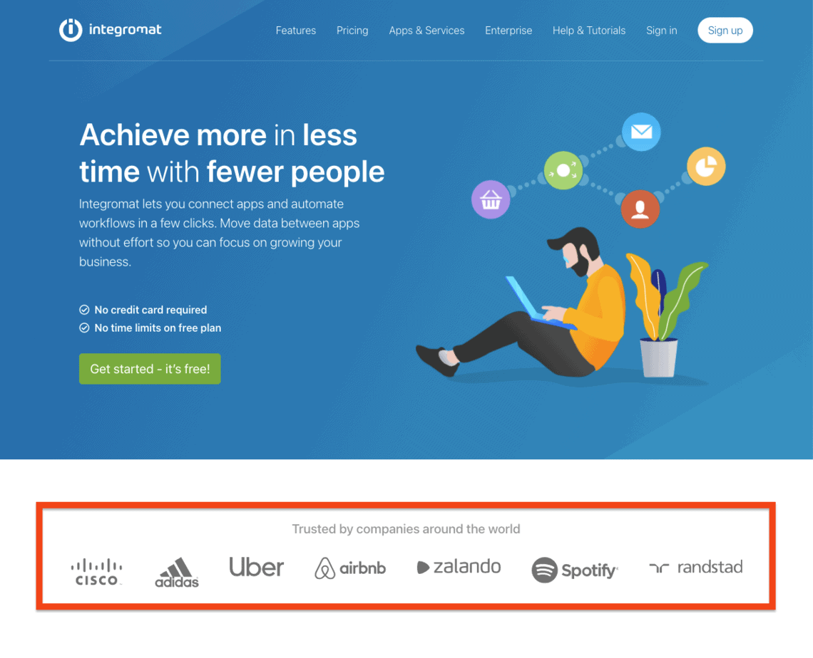
To reduce distractions from your sales funnel, you want to minimize anything that could divert the visitors from their goal. You also want to eliminate any distractions that come from unnecessary product options, links, or extraneous information, including sidebars and extensive headers. The less visual input and action options you have available for your visitors to process, the more likely they will make a conversion decision.
Even experienced marketers and UX designers can benefit from new ways to increase conversions. With my 10 principles, I have everything you need, from tapping into your customers' brains on a sales funnel or lead page, to what type of reviews and testimonials encourage repeat business!

Let me know if any of these sound like something that might work for you!

I’m currently working on my book on the subject of CRO and UX, and how they complete each other for a better user experience. This book is for the aspiring UX designer who wants to learn more about CRO and help them in their everyday design work. It’s packed with real-life examples, case studies from Silicon Valley companies, and tips on applying this knowledge to your projects.
You can sign up for my newsletter here to get the latest updates and a heads-up when it comes out for pre-order on Amazon.
You can also find me on Twitter, Instagram, and LinkedIn to continue the discussion! (or even email me)