Decision fatigue is a popular term used to describe when people have made too many decisions over a specific period. Research suggests that it mainly occurs as humans’ cognitive resources diminish with time. That’s why after you’ve been surfing Netflix for 30 minutes looking for something new, all you end up watching is ‘The Office’. Your decision-making has started to slip — even if it isn’t a bad show!
In product design, we try to reduce the number of decisions that a user needs to make. We assume that people are using the product to complete a task, and the more smoothly and intuitively it goes, the better. The more small decisions an individual is asked to make over a specific period, even if they’re trivial (like which show to watch on Netflix), the lower their quality of decision-making will be.
When you’re tired, this can significantly impact your ability to make decisions, and UX designers must know how fatigue affects users when they design interfaces for them. This topic is an interesting one because there are many reasons why people might experience cognitive overload when using your product.
This article looks at six ways to reduce the cognitive demand when you take on your next UX project.
The number of options we have as users is increasing exponentially every day. The internet has given us access to the world’s knowledge in seconds, not minutes like it used to take before computers were invented. This amount of choice can paralyze us, lowering our satisfaction and potentially leading us towards frustration instead of conversion.
When users are given too many choices, they will often get confused and frustrated. A product can have all of the features in the world, but when the interface is too convoluted because of this overabundance of choice, it does not end up being user-friendly. A study from the Journal of Personality and Social Psychology found that this often causes decision paralysis and frustration when we have too many options. [1]
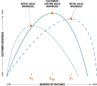
In the pursuit of maximizing initial sales or repurchases, companies might include too many or too few features in their products. By using the model provided by Harvard Business Review, companies are able to find the sweet spot for them based on their desired outcome.
Research has shown that people are more likely to purchase a limited number of choices. They will also be happier with their choice in this situation, leading to a greater sense of satisfaction.
The point is that companies have created too many options for the user, which can be wasteful and backfire on them. The customer may waste their time trying out all the possible products instead of committing and making an actual purchase. [2]
There are many myths in the world of UX on how many clicks to use and how much information the human brain can take in at once. The most important thing is that UX designers need to create a balance between simplicity and functionality, so they’re not asking customers too much work or too much thought about what’s happening with their decision.
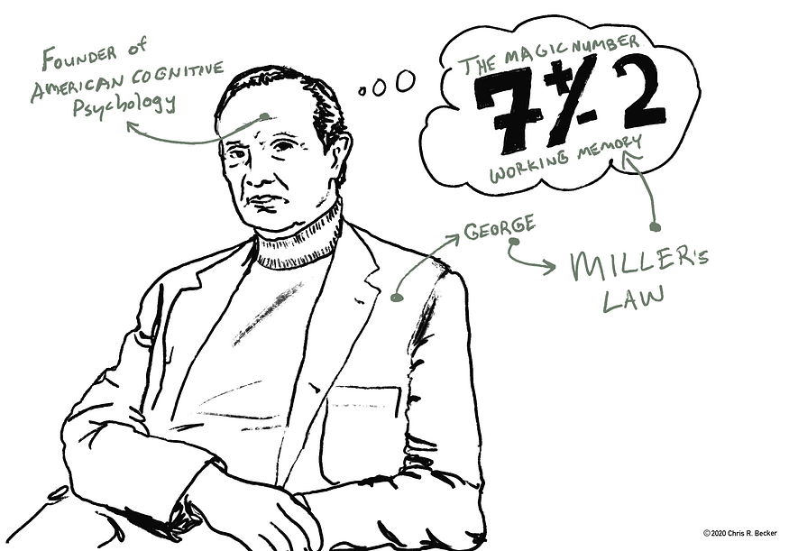
One of the most misunderstood theories out there is George Miller’s “Magic number 7”. Some people say that you should only have seven menu tabs or seven items in a drop-down list. This is not true. While I agree with this sentiment on some level because it seems more natural to stick within these boundaries, we must consider how information has changed over time and our brains, too. With websites and apps presenting data visually for us instead of memory-based recall like before, users can easily see all their options at once without having to remember them as they scroll through smaller screens (or by doing quick searches).
Recent studies have shown that people like menus with many choices. The more options we have, the better, as the user doesn’t have to spend time drilling down to find the relevant information. Websites and apps that present data visually, like Amazon listings with up to 90 category links on the home page, are more usable than sites that only offer limited options like categories with no subcategories.

It’s time to debunk yet another theory that doesn’t hold water: The commonly accepted but wholly untrue ‘three-click rule’, or the ever more spurious ‘two-tap rule.’ If you test and read a little bit more about it, users don’t find it frustrating if they can’t find what they need in three clicks. Neither user gratification nor success rate is affected by the number of clicks required to find it.

What’s more important than the number of menu tabs or drop-down listings is the user experience. A visual layout makes it easier to scan and remember every option. According to the theory of information foraging, the constant feeling of Information scent matters in your user experience. Users predict how satisfying the information they will encounter on a path is likely to be, and after exploring a user interface, decide whether their predictions were accurate.
The problem is that people have so many choices to make in their daily lives, and too much choice can be overwhelming. It’s not about the number of options you give them; it’s about how organized they are. You should reduce the number of choices, but the most important is your information structure. If your information isn’t well-organized or if there are an excessive amount of steps involved in a decision process, users will not bother trying to find what they’re looking for because they feel like it would take too long or require more effort than necessary.
To get better results from customer decisions on websites, I would suggest getting rid of anything unnecessary, such as extraneous tabs and links which distract users from finding what they’re looking for.
Let’s face it, sometimes we all make mistakes. It happens to the best of us! But what is a good UX designer to do if their user has made a mistake?
The answer: give them an easy way back to where they started.
By keeping the user on track, you are more likely to retain them as customers and not create a frustrating situation where they leave your website or app.
A good example is a 404 page. We have all seen one, and it can be frustrating not to find what we’re looking for. One example of how to fix this is by adding a “back” button, which will take the user back to where they were before trying to go elsewhere.
The 404 page is also a golden opportunity to guide the user into explorer mode and discover something they didn’t know they were looking for. Here are some examples of good ways to do it:
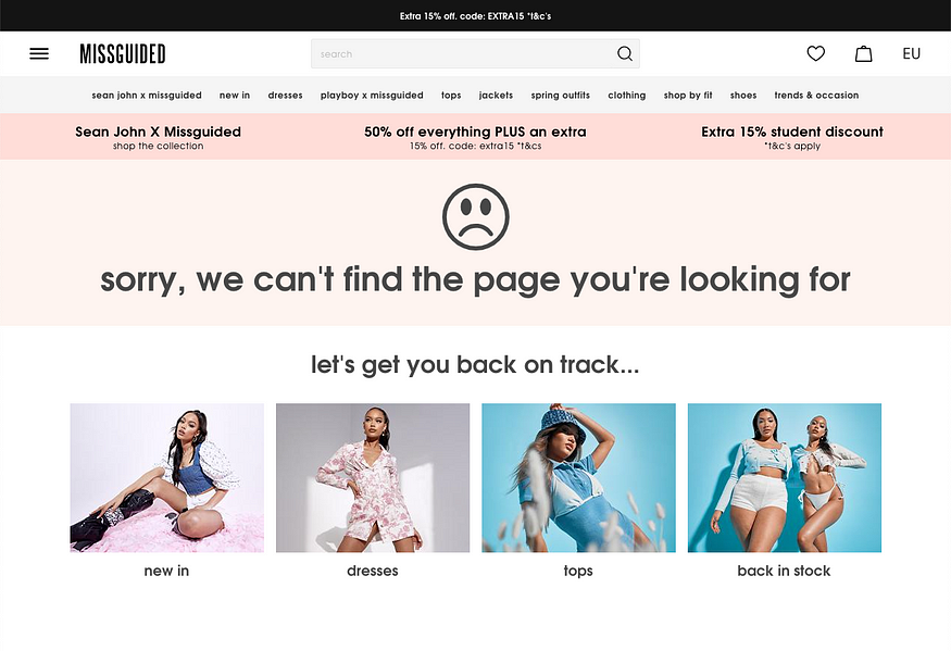
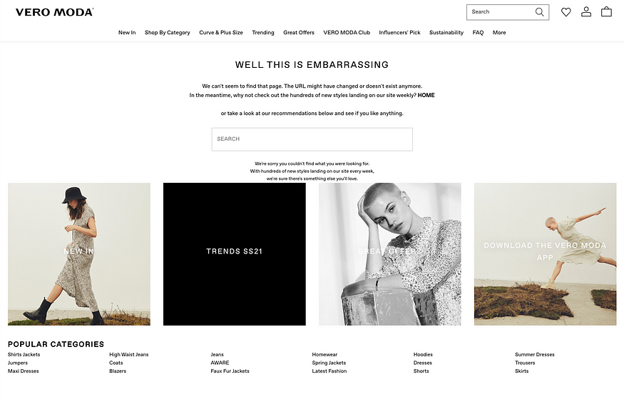
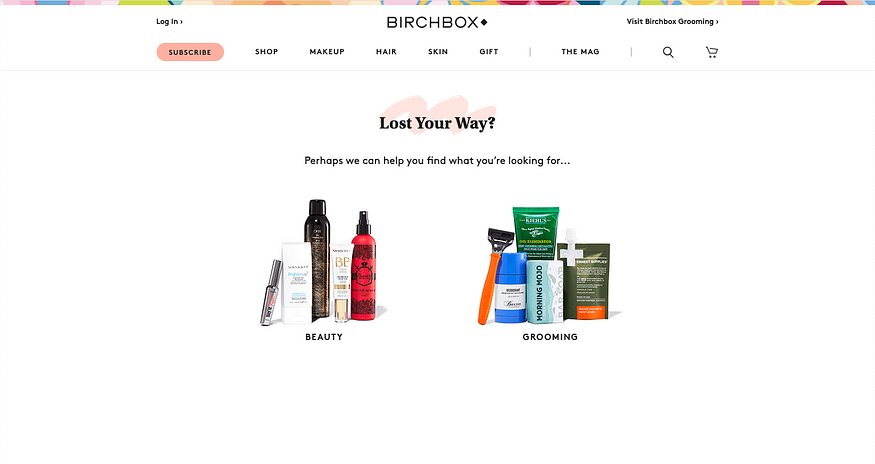
These are some best practices that I always take with me when I design a user flow:
Navigation is the core of any website or app. It’s what makes your design accessible and usable for everyone. A sound navigation system for your specific use case can be hard to find, but it’s crucial for the user experience. A bad one is frustrating and distracting, which leads to a bad experience overall.
The UX of the navigation should be intuitive and easy to use. The user should always know where they are, what’s available to them at that very moment, and how to get there. A good way is to give the user cues in their surroundings or appearance on screen: a different color theme when changing sections and clear messaging about what function can be found under each menu item. These little touches help make navigating your website or app an enjoyable experience rather than something difficult.
The right amount of visual cues can:
The CXL Institute did some impressive research on this with a landing page, showing different examples to users. The institute made six different examples for the user with variations of visual cues to guide them to fill out a form on the page.


They looked at the time spent fixating on the form and how long it took to find the form. If participants stated that they would fill out the form to contact the firm, the visual cue successfully directed their attention towards the form and increased their chances of remembering.
And the result? It did have a significant impact on the number of users that filled out the form. The hand-drawn arrow was eye-catching and had an artistic flair to it, which caught their attention in a way no other design could replicate. And as for our man looking away from his computer screen… new research proves he got half the responses compared to any other participant!

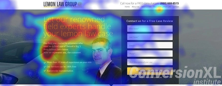
The data from this study tells us that hand-drawn arrows and other directional objects for guiding the user’s attention are worth testing on your site, especially if they point to a CTA or critical feature of your site.
And while there is no one correct answer for pictures of humans in forms and CTA areas, we can tell you that at least make sure the person you are using is facing the form’s direction.
When designing a new interface, it’s essential to keep the cognitive load on your audience as low as possible. One way of doing this is by using patterns and conventions that are already familiar to them. But how do you know what these conventions are?
I’ll show you three examples of common UX design conventions that will make your users feel more at home when interacting with your product or service. This will help reduce their cognitive load and get them started faster with whatever it is you’re trying to teach them.
A consistent color scheme can be the difference between a good design and an amazing one. There are many reasons to use a cohesive color palette, but one of the most important is that it makes navigation easier for users.
The human eye is drawn to color, so if you use the same color throughout your interface, it will be easier for people to find their way around. This means that they won’t have to spend as much energy figuring out where things are or how to get back on track when they make a mistake.
It’s essential not just to follow common UX conventions but also to reuse them. When you do this, two extraordinary things happen:
A great example of this is the use of breadcrumbs in web navigation. They show users where they are and how to get back so that a simple mistake doesn’t mean time spent trying to find their way out by themselves.
Another good suggestion might be making your menu bar stay at the top or bottom of a site no matter which page you’re looking at. This helps people feel oriented because it lessens cognitive load when deciding what action needs to occur next — like clicking on an item from a list, for instance.
Icons are a great way to communicate an action or object in your app. They’re easy to understand and universally recognizable, so they’re perfect for quick interactions. Adding icons and symbols that are already widely understood can help keep your app’s content from feeling too complex without becoming overwhelming.
One thing to be careful of is to make sure you’re using icons that are widely recognized for what they are — an example is a house. This icon is universally recognized as an icon for “home” or a start screen. The same with a trashcan — this icon is recognized as a trash icon to delete an element.
Many companies have gone down the path of using icons no one understands, which creates confusion and frustration for the user. To also make sure that the icon is understood, you should always add a label to it.
We all know that we should be designing for our end-users, but it’s not always easy. When you’re in the middle of a design project and trying to figure out what your user needs or how they’ll react, it can be hard to keep them at the forefront of your mind.
Luckily, you can use some simple tricks to make sure you’re designing with your users in mind. Some people find that writing down their thoughts from a first-person perspective helps visualize themselves as the end-user. In contrast, others find that breaking up their workday into short periods where they focus on designing only one persona is more effective.
The best way to design with your users in mind is by listening to their input. When you’re working on a new project and thinking about how it should work for them, make sure that you speak to the end-users directly before moving onto prototyping or finalizing any decisions.
To do this, try asking questions like
You’ll be surprised at what insights they can provide and how they will change your prototype’s direction.
There are several UX research techniques you can use to make sure you’re designing with the user in mind:
(The list is inconclusive, of course — there’s many more!)
Have the mindset that the consumer is not stupid and wants to be empowered with the correct information to help them decide. The problem is that too often, product owners get so caught up in all of the features of their product, and what it can do for users, they forget about how overwhelming a new user might feel if there are too many options and features.
If you are a product owner, consider how your user might feel when faced with too many choices or features and allow them to explore the ones they find most interesting.
For example, in your eCommerce site, instead of a user being able to choose from 50 different fabrics for their sofa that they are interested in buying, it might be better if there were only three or four choices upfront and instead offer some consultation to have a tailored experience for the user. You can also consider hiding some options until you’ve found what suits you best by using visual cues like eye-catching buttons with an “Explore more” text above them.
One way to also make sure the most crucial information is presented to the user is by designing the information flow in a pyramid shape where the essential information is presented first. The less critical data is reserved for secondary screens.
If you’re considering a new design or layout for your site, use an online tool like UsabilityHub Polls which lets you test designs on actual users before moving forward so what’s best for them isn’t overlooked as they could be during development when it can be more difficult figuring out how something will feel once it’s live.
Decision fatigue is a popular term used to describe when people have made too many decisions over a specific period. Research suggests that it mainly occurs as humans’ cognitive resources diminish with time. Decision fatigue can happen when there are too many choices to consider or when the decisions being made seem inconsequential and don’t warrant any attention.
We’ve provided six ways you can help reduce decision fatigue in your products and services so that customers are more likely to stay on track, achieve their goals, and give you the green light for another sale!
Have any of these helped you? Let me know in the comments below or reach out directly at alexander@radahl.no.