In this article, we’ll dive into the importance of UX and CRO in E-commerce, discover the various malfunctioning UX and CRO strategies, and see how we can rectify them using user-focused approaches to obtain maximum conversions.
In non-technical language, UX or User Experience revolves around the experience or perception of a user that takes shape after they interact with a product, device, service, or website.
CRO or Conversion Rate Optimization is the enhancement of a webpage based on the behaviour of the users landing on the page to accomplish their desired goals, thereby increasing its traffic.
Both UX and CRO sound similar in terms of analyzing visitor’s behavior and usability testing. But on further inspection, both use distinct approaches to solve a problem. CRO answers us on “what is happening on the website?” whereas UX comprehends, “why is it happening?”.
For example, if a website is selling T-shirts and the visitors are not buying them as anticipated, leading to poor sales, we can assume the site is not converting and it has a poor CRO. On the other hand, when the site lays out a range of T-shirts in different price ranges, sizes, styles, and colours, how do we know what the visitors might like and how would they like it? You guessed it, that is where UX comes to play.
Both UX and CRO have been gaining traction in the last few decades, ever since the E-commerce industry started to flourish. The reason — the development of E-commerce platforms being extremely complex requires regular trials and errors and customer engagement. Optimum CRO and UX strategies help to overcome these hurdles.
E-commerce brands having similar products/services in a competitive marketplace often give the wrong impression of copying each other to increase their sales. But that doesn’t always work. It can lead to multiple repercussions sooner or later.
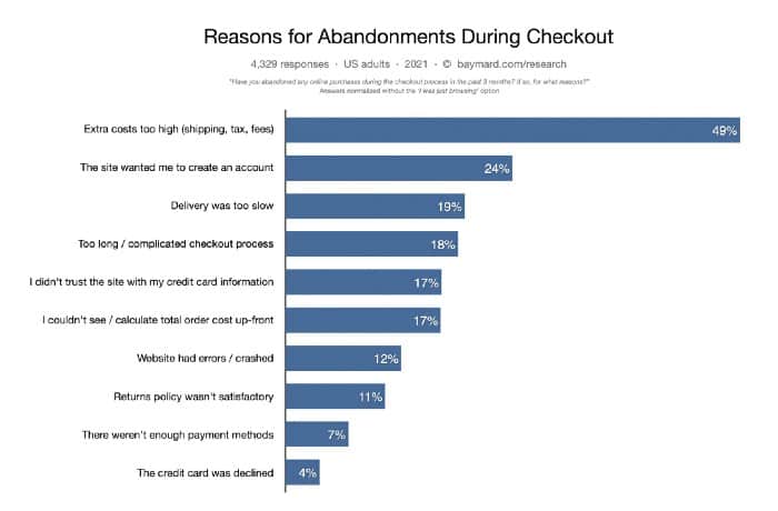
Factors as bad UX, not understanding your users, or not optimizing the site according to their needs, cannot only lead to the loss of visitors or revenue but also to a negative brand perception of any online business. Practices like non-opening product listings in a new tab, poor-quality product images, out-of-stocks listings, no search bar at the top part of the page can annoy the shoppers. Recent data from Baymard Institute suggests that nearly 70% of users leave the site without checking out on popular E-commerce platforms.

In conclusion, if the UX and CRO are rightly optimized then,
Let us look at the effects of bad UX and CRO strategies, and how designers can rectify them for their users, specifically increasing the overall conversion rates.

In a Nutshell: The ideal approach to make use of time-bound offers or limited availability is by providing the user, sufficient time to make an informed decision. You can even give them the exact details of availability.
Creating a state of urgency is an effective strategy while motivating the users to make a purchase, but only when implemented correctly. This tactic fails when some businesses create a compulsion or forcefully persuade their users to buy, instead of letting them decide for themselves.
If there’s a limited sale running for a few days or a week, then the idea of urgency is valid. The short period gives the users enough time to evaluate and decide whether they would want to opt for the deal. It becomes a win-win choice for both sides.
But that’s not the case with every website these days. Numerous sites have their “Hurry Up” deals presented as early-bird-discounts, lasting only a few minutes. Everyone who lands on their site has to view these deals, plus the user only gets a few minutes to make a decision.
Does it work? — It’s a delusionary approach. After being immensely confused, users decide to leave the offer and the site as well. Many users understand the catch and paint an overall negative picture of the brand. It leads to less sales than predicted.
In a Nutshell: Limit the site loading time to less than a second, or else the user will exit in no time.
The reason why most of the visitors don’t convert is because of the waiting time while loading the website. When we talk about loading time, we talk about seconds. The Nielsen Norman Group has devised three-time limits while optimizing web and application performance:
0.1 second — The webpage is reacting instantly for the user.
1 second — The slight delay is noticeable to the user, so they’ll experience a little discomfort.
10 seconds- The user tends to abandon the page.
Making the user wait for 10 seconds or more is bound to annoy them and lessen the conversion rate. So the goal here is to keep the loading time less than a second if possible.
In a Nutshell: Sign up requests are tedious and annoying to users. Use better visible options like one-time guest checkout.
A few websites request their users to create an account or sign up to their website to continue viewing their services/products or buy something. “Sign Up to Continue” is one of the most prominent reasons why users put a halt on their shopping spree even after adding it to the cart. According to 2020 data published by Baymard Institute, a whopping 18% of websites still had ‘create an account to continue’ request while scrolling through their products.
The daunting task of creating a profile and entering the phone number, address, email ID, creating a password, passing the security test, and verifying the email is not of the majority’s interest (especially if it’s a one-time purchase). Moreover, sharing personal data is a big turn off for some users.

In a Nutshell: Manipulating your users to choose the most over-priced plans are just quick fixes and don’t always work. It creates a bitter experience for them. Hence, deliver them exactly what they want, and upsell based on that in the future.
Your users should know the price of your products. There is a multitude of pricing options to display them to increase conversion rates. But some are only conversion-focused rather than user-focused.
According to a psychological study, the users tend to select the first option listed on the pricing page available to them, irrespective of the prices. The theory suggests that one should put forward their most expensive offer first because there is a high chance for the visitor to go with that option itself. That means more revenue for your E-commerce business.
If the most heavily priced subscription layouts of your site don’t fit well with the user’s needs, then the user is likely to leave the site. As explained by HubSpot, when the users buy expensive services from a site opposing to their actual needs, it creates a slight bitterness towards the brand. Poor market-fit influences the user-churn-out-rates.
In a Nutshell: When using pop-ups, make sure they are functional, relevant, timely, and have a ‘close pop-up’ option visible to the users.
Nowadays, pop-ups are present on every site you visit. Unfortunately, the marketing team focuses on getting more leads than finding out how many of these leads turn into actual customers.

Yes, it does, but only when the pop-ups are useful, relevant, and timely. Generally, businesses use this strategy for personal gains only. But sometimes, it can be disruptive and hamper the conversion and consumption flow of the user. Moreover, if there’s no option available on the site for closing an irrelevant pop-up, then the design looks substandard and annoying.
The same can also apply for exit-intent popups — content has to be useful, relevant, and timely. Exit-intent popups having no closing options are a disaster.
Both UX and CRO strategies make a significant positive impact on the E-commerce channels, as long as they are more user-focused than being conversion focused. Many of the above-discussed tactics automatically improve the conversions only when they make their users the main priority first. If you only aim for conversions, then you’re only opting for quick fixes. But if you want to make a long-lasting impact with your brand in the market, you should primarily focus on what the users need or demand and then improve the usability of your site. Therefore we can say, both CRO and UX go hand-in-hand while creating a long-lasting brand impact.