The e-commerce industry is booming, with Statista estimating eCommerce sales to be $6.3 trillion in 2024, up from $4.2 trillion in 2020. Much of this growth is due to the increased focus on eCommerce conversion rate and user experience for eCommerce websites. Conversion rate optimization (CRO) is a process that aims to maximize conversions by improving the user experience and design of websites based on data collected through user research and testing of your eCommerce business. There are many CRO tactics at your disposal. In this article, we will take a deeper look at how you can implement them in your strategy to increase conversions, customer satisfaction and revenue!
Conversion on an eCommerce store is the proportion of visitors making a purchase. Throughout the e-commerce industry, the typical conversion rate is around 1-2%. You can double your sales by improving your e-commerce conversions by only 1%. The following formula can be used to determine your conversion rate: If you have 15 sales from 1000 visitors, you will have a conversion rate of 1.5%.

By implementing the methods discussed in this article, you will hopefully increase conversion rates. These methods are perfectly in line with the latest articles I have published on micro and macro conversions, landing page optimization, and ties into one of my main topics: Conversion Rate Optimization (CRO).
eCommerce retailers use ecommerce conversion rate as a benchmark to determine how they fare against others, and most eCommerce retailers track conversion rates to identify areas of improvement for their online shoppers. Conversion rates are commonly calculated by dividing total transactions (orders) by the number of unique visitors to the site.

Online store owners often deploy tools where they can monitor ecommerce conversion rates in real-time and dig into segments of the data to discover where the highest conversion rates come from and what they can do to plan a proper strategy for conversion rate optimization.
eCommerce Conversion Rate = Total Transactions / Unique Visitors

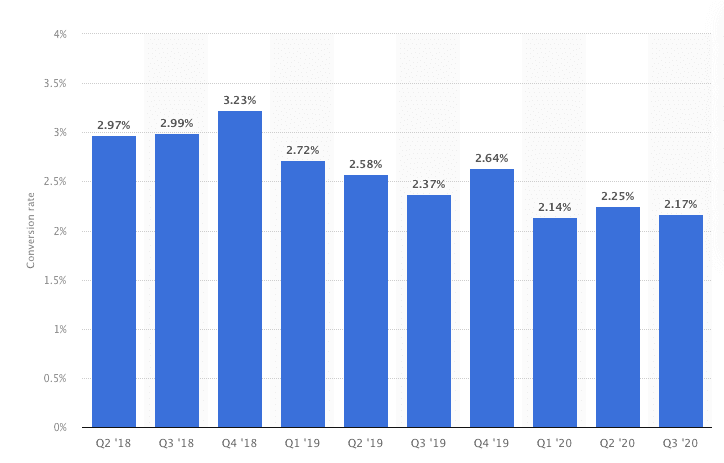
The conversion rate for eCommerce can vary heavily on industry, country and target audience. But if we look at the industry, Statista says, the average conversion rate for e-commerce stores in the US is 2.06% in the third quarter of 2020.
Every eCommerce business is different, as are its customers. This makes it crucial to do your research to find the conversion killer for your eCommerce site. You can't always rely on tips and tricks from the web. Test, test, test! This is the keyword to find the conversion killer for your online business.
In last week's article on landing page optimization, I went deep into the importance of A/B testing for a landing page and exactly what the benefits are, and that also applies here. Start by looking at what potential customers do on your website with the help of heat maps and session recordings, and then test solutions that you think will help improve the shopping experience and increase sales. You can also look at your competitors to see what they are doing better than you when it comes to conversion rate optimization.
I have outlined some important and broad points that I think you should study and consider as a starting point for optimizing the conversion rate of eCommerce. This is in no way everything you can do, but merely methods that can get the ball going for you and your business.
The CTA or Call-to-Action is what you want the visitor to do when they arrive at your website. It could be anything from an e-commerce purchase to a newsletter sign-up, and everything else that encourages them to move forward on your site!
The eCommerce website should have a clearly visible and precise call-to-action in its sales funnel or on every product page, which will invite customers to take advantage of discounts, buy products at the moment, etc. But you also have to be careful, because if your eCommerce site has too many CTAs, it leads to confusion. You should carefully choose the most relevant call-to-action for each page and offer only one action per page to avoid negative effects on the user experience.

It is also crucial that eCommerce companies use a distinct CTA button color, because this helps visitors understand what they should do next. You also need to make sure that the CTA button of the eCommerce website is always above the fold - which means that it does not have to scroll down on mobile devices or longer pages.
Abandoned carts are a perplexing problem for e-commerce websites. These are e-commerce carts abandoned for one reason or another. It is essential to monitor these abandoned cars to generate profit and create a positive customer experience.
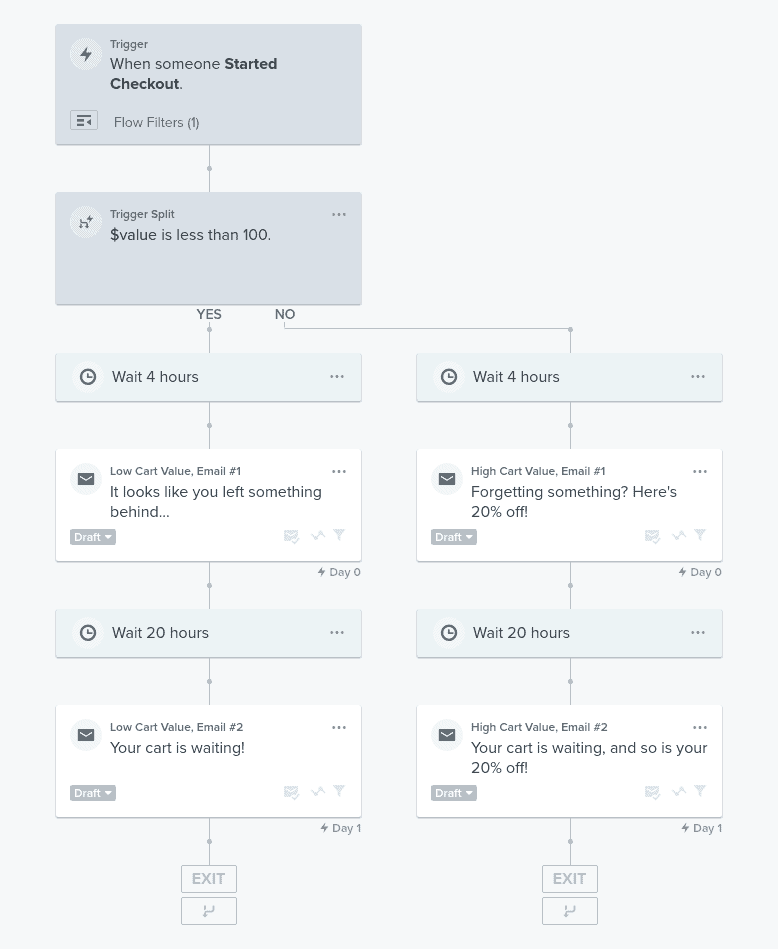
The question is, how do you contact these e-commerce shoppers? There are many ways to do this, but typically e-commerce websites have e-capture forms integrated into the checkout process so that the customer can give their e-mail address and be contacted later about their possible purchase. You can also create an incentive for e-commerce shoppers to return by giving them a discount code that they can use in the future when they return to finish their transaction.

According to Baymard Institute, the average industry standard for abandoned carts is a whopping 70%! This is a lot of lost customers and revenue that you can easily recoup with some simple optimizations. If we look at it in terms of pure dollars, it's $18 billion a year lost down the drain.

I will discuss some more in-depth steps that you can take to not get to this point, but when it happens (because it will), here are some ways to get your customers back:
One of the most important elements of eCommerce is the quality of the product page. Customers are more likely to buy products if they can get a beautiful visual representation of the products you sell. Make sure the images are of high quality, and be creative with how you display your products. You can use special effects or even embed video to get people excited about the product they are looking for!
Did you know that visual presentations, such as photos and videos, are the most effective way for around 65% of people to learn? Visually explaining your products and showing how they can be used can have a huge impact on your conversion rates. Another fact I discovered fascinating and relevant is that when businesses use more exciting pictures in their marketing materials, they get up to 94% more eyeballs on their marketing content than their competitors.

It is more important to show your product in a good light than it might seem. A first impression means everything when you want a person's trust, which starts with getting them to notice the branding and product photos! As soon as they realize that something looks cool or useful, an image or video will help ensure this continues throughout their journey by learning what kind of products you offer on your eCommerce. So go ahead: try to make yourself look awesome (or at least like someone worth knowing)!
The most obvious obstacle stopping visitors from buying is trust. Why should someone trust a random eCommerce site suddenly pop up in their news feed on Instagram? You have to make visitors feel safe and secure, so they can convert with the confidence that their personal details are protected.
This starts with building a brand that is established as a leader in your industry. Make sure you use logos and other design elements that make visitors feel they can trust your eCommerce website. In my opinion, it is very easy to determine which brand is made by a armature compared to a professional.

Trust begins the moment potential customers land on your eCommerce site, and they start reading or interacting with your brand and message. An excellent e-commerce store also has high-quality product image and a descriptive copy that answers all your consumers' questions about the goods, from what they are made of to how they are delivered.
It is also important that the site loads quickly. The notion of web performance is becoming increasingly popular, and if your customer's website is slower than Amazon, it will damage their reputation. In my article on landing page optimization, I discussed how to increase the speed of your site.
You have to show your customers that you know what is important, and don't let anyone take advantage of it. An excellent way, for example, is to display third-party reviews from TrustPilot or Google reviews on the product page, which makes consumers feel safer when they buy from your eCommerce.
Moreover, the use of security seals can go a long way, as these types of logos mean official approval, so people have no reservations when purchasing products online, especially if there are no additional costs associated with returning them, unlike other websites where they could spend even more money just to return the item. I will also touch a little more on the use of social proof later in the article.
Customers choose where they make purchases for various reasons, including the presence or absence of an adequate and comprehensive return policy. Studies show that generous policies do not lead to higher returns, but lead to more sales and repeat customers. According to Web Retailer, if your e-commerce business has 40% repeat customers (or more), you are likely to have 50% more sales compared to sites where only 10% of their customers return. As you can see, it is important to implement strategies to build trust and repeat customers to increase that eCommerce conversion rate

Websites often neglect to focus on copywriting and product descriptions, but this can be expensive. Product page copies are crucial for conversion rates, as they provide more detailed information about your products that can help potential customers make an informed decision when purchasing from your online store! It could also give them the competitive advantage by making it easier than others who do not make so much effort in their web content strategy.
In search engines such as Google, where customer reviews play such an important role in ranking websites, it is more important than ever to provide your customers with excellent writing and informative content.
A recent study by Unbounce in 2020 shows that the copy that works best for eCommerce websites is easy to read and effectively conveys the message. In fact, they recommend your content be written for middle school reading. Try to make every sentence as simple and concise as possible to convey your message.
According to Conversion Rate Experts, conversions may be increased by 35.62 percent by using some of the most common checkout optimization techniques. Although it is not easy to reach this figure, it is certainly feasible with modest changes to the check-out page.

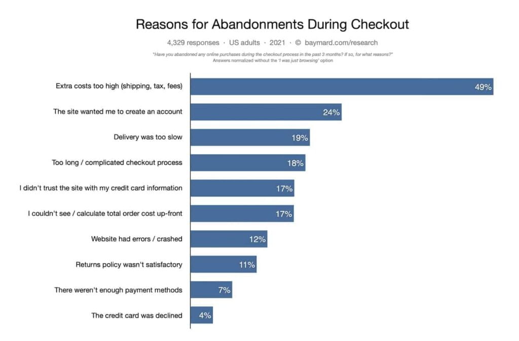
The need to create an account was cited by 34 percent of respondents as one of the primary reasons for cart and checkout abandonment, according to Baymard Institute. Already here we have an easy fix to increase your eCommerce conversion rate with the help of guest checkout. If you don't have to have the user create an account, just leave it out. Or you can create a checkbox option for them if they want to create it. The best option would be to create a smooth guest checkout experience that lets more visitors flow through the checkout process without any hassles of creating an account.
The next biggest reason for not going through with a purchase is the need to fill out endless forms on the checkout page. 26% of responders to the Baymard Institute study gave this as a reason for not becoming one of your potential loyal customers. According to the Baymard Institute, e-commerce businesses have 23.48 form components and 14.88 form fields for new non-account consumers on average. This is too many fields in a checkout process, and causes friction and frustration at the checkout.
“During testing, we consistently observe that users are overwhelmed and intimidated when seeing a high amount of form fields and selections,” states the The Baymard Institute study.
The bar graph below shows how UX performance degrades as number of form fields increases, and so does the conversion rate.

Some of the most optimized check processes often have half the number of fields. This is achieved by cutting out unnecessary fields and merging fields such as first and last names into one, and using live search for addresses through services such as the Google Maps API.
Accepting multiple payment options is a convenient option for eCommerce businesses, because it allows them to service clients who may not have one particular type of credit card, and can help increase conversion rate in territories you wouldn't have thought of. If your clients do not have enough payment alternatives, they will abandon their carts, but you'll also lose customers to your rivals. Adding additional payment choices is one of the most efficient strategies to decrease cart abandonment and boost conversions.
It can also be an excellent idea to offer your customers some sort of financing option through services such as AfterPay, Klarna or PayPal credit. You can also implement payment checkouts from Stripe or PayPal to offer a wide range of payment options through a service.
In eCommerce, there is a fine line between creating interest and scaring away customers. To optimize your eCommerce conversion rate, you need to find the optimal balance of social proof from existing customers that encourages customer conversions. Social proof can come in many forms - reviews, testimonials, endorsements, ratings and more. Online buyers are more comfortable purchasing from an e-commerce store when they realize that their friends and family have done so. Social proof is therefore an important component of conversion optimization.

According to a study, 27% of customers use reviews and social proof to determine which company to support. By contrast, only 24% of consumers never consult a company's online evaluation before making a purchase. Customers nowadays have many options, and reviews can be an important tool to narrow them down and increase the conversion rate of your store.
Social proof can be a powerful tool for businesses and consumers alike, but it is important to remember that there are two sides. If your Facebook feed or Twitter account has negative social media posts about your product or service, you may fall victim to this phenomenon - discourage potential customers from trying out the products or services you sell.
The problem worsens with online reviews published on social channels, where every person's voice is strengthened by being able to contact companies directly and very publicly with their problems. This means you have to respond quickly when dealing with complaints about goods, otherwise it may appear you are not taking complaints seriously.
Companies can use positive social proof to their advantage. If you receive an excellent review on TrustPilot or another site, consider putting it on your site - perhaps as part of a dedicated review page or product page. You can also consider incorporating it into your social media strategy to show your customers and reputation.
E-commerce conversion rates are a big deal, but it can be difficult to figure out how to improve them. eCommerce conversions are important, and they are also demanding to optimize. Most eCommerce stores settle for 2-3% conversions, which means most of your marketing efforts end up being wasted.

I hope this article has provided you with some tips for optimizing conversion rates in eCommerce that you can use to improve conversions in your eCommerce store. If not, don't hesitate to contact me for more advice on how to optimize eCommerce sales and marketing efforts. This article is intended as a starting point for your optimization efforts, and is not a final blueprint, as it contains far too much information to cover in an article!