The design of an application affects the experience that the user has with it. How do you know what your users are thinking? The Five Principles of UX Design Psychology can help you gain insight into your customer’s minds by predicting their behavior and needs.
In this article, we will discuss each principle and show how they apply to real-world scenarios. We’ll also explore some best practices for designing applications based on these principles so that people will enjoy using them!
As UX designers, we are often expected to read people’s minds (not literally), understand precisely what they want and need, and then design a product that will meet those needs. It’s an impossible task, but luckily, UX Design Psychology’s five principles can help guide us through the maze!
The Principle of Least Effort states that people will take the path or make an action requiring the least amount of mental and physical energy.
In other words, the less you ask your users to think about what they are doing to use your application, the better! This is an excellent principle for UX designers because it can help them understand why some design decisions have been made; if there was no consideration given for this principle, more work might need to be done.
The design process is an iterative one, meaning you will make changes and grow over time. This may not be an issue if your app was only meant to last for a short while, but in many cases, that’s not the case. When considering updates or redesigns, it’s essential to keep this principle in mind because users are likely to get annoyed with having too many changes made without their knowledge; after all, they interact with the interface on just about every platform, so UX consistency is critical!
Designing an app can seem like something you’ll never finish — even when everything looks perfect, there might still be some tiny detail left undone, which could cause problems down the line. With constant feedback from clients and multiple testing sessions, these problems can easily be avoided by following a few easy steps for clarity and design continuity.
It’s no surprise that people are always seeking fast and easy solutions with digital content. This principle is the guiding force behind UX design, which is why society now demands flawless user experience on both desktop and mobile devices more than ever before, as this accounts for a substantial share of consumption of content.
Cognitive principles are the natural way that humans interact with digital devices. To explore this connection, psychologist and cognitive scientist Susan Weinschenk has studied how psychology can be applied to UX design to work best for a human’s brain.

Designing websites and apps is, in a sense, an ingenious form of communication. Understanding how we think on all fronts and how we perceive patterns as they unfold is essential to this generation’s UX designers.
I had a chat with Bram Jansen, Chief Editor of vpnAlert. They have worked a lot with this first UX law in their company, and he told about three ways they use the law of least effort in their designs:
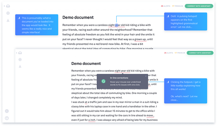
2. Use grouping if there is a lot of comparable information. Use sorting and filtering if the groupings are enormous. Having a Search Bar is also a fantastic idea. For example, if you have many posts on your website’s Blog page, try categorizing them by subjects. Consider introducing date-based sorting or filtering. Furthermore, the Search Bar will allow your users to swiftly and simply locate what they are looking for.
3. Also, keep in mind the text size, color, and contrast. It’s an issue if the text is too tiny to read without resizing the website. It’s also a reading issue if the text and background colors don’t contrast well enough or if they don’t interact effectively enough. Use tools like Usecontrast and Colorsafe to evaluate this factorial design psychology aspect.
Understanding how humans perceive and react to design is crucial for any sound designer. When developing a site or app, qualitative analytics are vital in giving you insights into what users do when interacting with your product. By integrating these findings into how we create our designs, designers can build something that truly resonates with people’s needs.
The principle was named after the German psychologist and philosopher Hedwig von Restorff. Von Restorff’s Principle, also known as The Isolation Effect, Predicts that the different ones will be more memorable when there are many similar objects because they stand out from all of the other identical things.
Designers often use this to improve usability for their interface by giving users a prominent call-to-action to take action with. It’s also used to study memory processes by manipulating the degree of similarity between two objects and observers’ performance for discriminating them. The principle is so prevalent in design it has been made into its wordmark called “Von Restoff effect”.

Designing interfaces according to this theory can make interfaces easier for people who have difficulty distinguishing objects. For example, a user with dyslexia might find it difficult to differentiate between the text for “submit” and “cancel”. Designing these two buttons to have some visual differences will make interfaces easier for users who need more time-consuming processing of information.
Designing interfaces is a delicate balance of getting inside your users’ heads and making their experience as positive as possible. Sometimes this means being creative with fonts, colors, or shapes to complete specific actions. If you’re giving them a long form to fill out, but it’s too difficult for them to see the current step they should be on, provide bullets that show progress, so they know how much further there is left before completion!
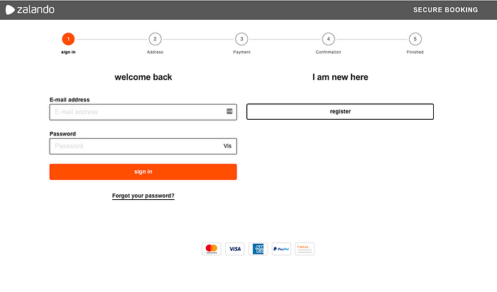
We can’t just design an interface without considering what our users will think about it — after all, we are designing something right in front of their eyes every day when we use technology at work and at home.
The better our input tone reflects these nuances, the more successful we’ll be at improving overall usability through emphasizing specific information or highlighting critical steps.
Differentiating your plans by making them different shapes, sizes and colors will catch a user’s attention. If you want to show all of the offered plans in an unbiased way, make sure they’re similar in size/shape/color so that no plan is more favored than others.

We have to consider how our brains work to design an interface that will be useful and effective. This is called cognitive psychology, which studies the human mind and brain functions to make better interfaces for humans. The Von Restorff effect is one of those concepts from cognitive psychology that can help us create a more usable UX by using visual cues or highlighting important information on the screen.

However, the Von Restorff effect can work against you if something goes wrong. Apple Music wasn’t great when it first came out. People across the internet attacked it for being messy, hard to use, and bad at its job — which is not surprising in light of how well designed every other product has been from this company up until now! While some people report that it’s gotten better over time since launch with many new features added each year, including Beats 1 radio stations as well as an all-new design makeover on iOS devices, Apple music will always have a poor reputation burned into them because they didn’t get off to such a good start due entirely to their incompetence.
Von Restorff’s effect can be used in various ways to make our lives easier; check out these four!
These Von Restorff effect techniques are just some ways designers use psychology in UX Design. What do you think? Do these have value for us and our work? Let me know what you think about this article in the comments or directly email me!

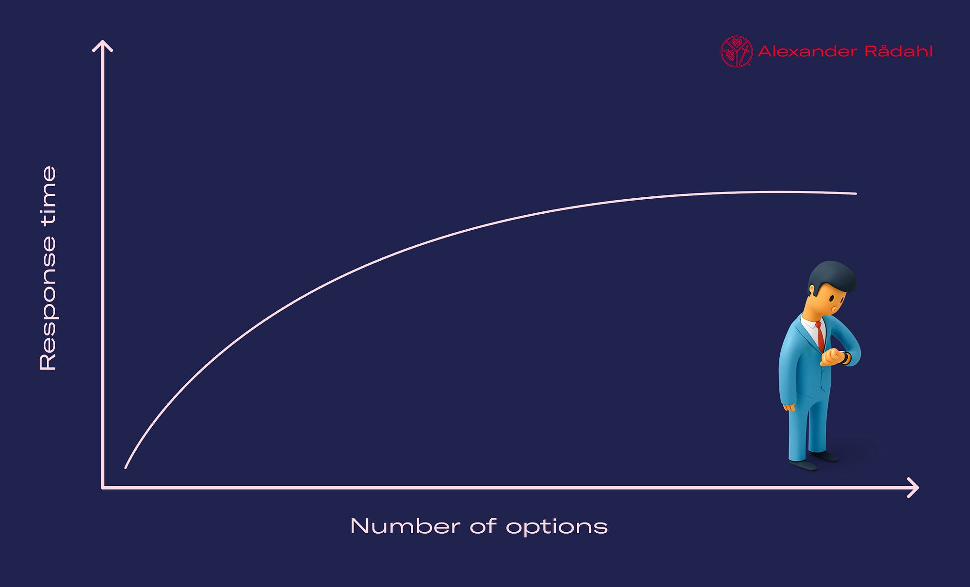
Hick’s Law clarifies that how long a person takes to make decisions depends on the number of choices they are offered.
The more options you present, the longer someone will take to decide because their cognitive load has increased significantly, and providing too many options at once can stifle user experience as there becomes an unnecessary level of complexity in your product. [1]
One way UX designers have found for new users not to be overwhelmed with all those different functions available when using apps is through onboarding programs: these short tutorials teach them what buttons do what so that they don’t needlessly click around or search aimlessly throughout your app looking for something specific; rather than having a feeling like “I should know where I want to go” but then not knowing where to go.
The design of an app should be tailored for the needs of its users, something every UX designer knows, and what one user might find intuitive could overwhelm another with too many options at once or make them feel like it’s not worth their time to explore because they’re lost in all those choices. To overcome this challenge as UX designers, you need to figure out which features your audience will use most often and provide shortcuts that are easy for everyone else. There shouldn't be any cognitive overload when trying to navigate through the app interface. That way, someone can have a more pleasant experience using your product without feeling frustrated.
The more complicated your decisions, the easier it is for your brain to get overwhelmed.
When you’re under pressure, and things go wrong, all of those quick-decision making skills are gone in an instant because stress has taken over. It takes time — sometimes a lot of extra time — to recover from that after something stressful occurs. That’s why when response times are critical, Hick’s Law should always be used: keep the choices limited, so there isn’t too much input coming at once which will make decision-making quicker without having tunnel vision or getting overloaded with sensory information.
Hick’s law is perfect for simplifying significant, complex processes. With this rule in mind, as a UX designer, you can break down the process into smaller steps to keep from overwhelming your user with information at once. For example, suppose you’re designing a payment system that has three screens. In that case, one showing cart details and another introducing delivery options before asking about account creation-you’ll be able to give users all of the necessary info without making them feel like they have too many choices at once or needlessly scrolling back through pages on their screen.
The simple rule states that the more options you offer to a person in a system, the longer it takes them to make decisions. This generally occurs because people are unable to process more than one thing at once — in other words, we tend not to be able to think about two things simultaneously and take in information from both of these sources.
Instead of adding any unnecessary steps or screens into your user experience design — which would only slow down decision-making even further by introducing new choices for users to sift through — try breaking up tasks with ease, so there is less input required on their part, from deciding between sizes and colors (say for shoes) where each size has its own screen giving all relevant info without having to scroll back to the top of the page.
The serial position effect is a cognitive bias that dictates our ability to recall, recognize and organize data in a list.
When participants in experiments are asked to identify or recognize items from a list, they do so better when the items are presented at the beginning of the list than at the end. For example, you might be more likely to remember the first item on your grocery list than one which is towards the end of your shopping trip.
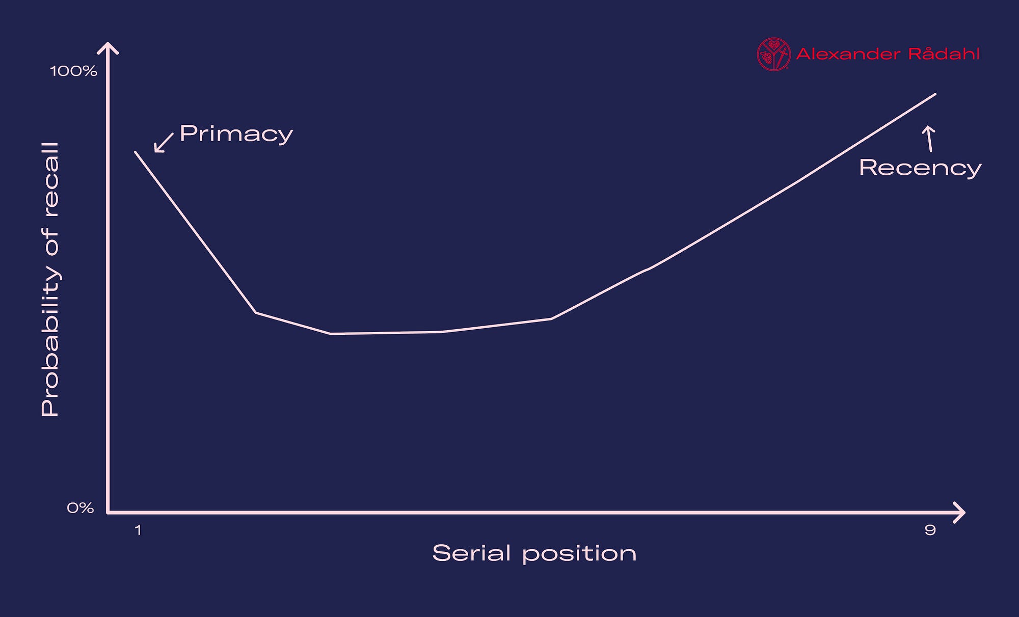
Hermann Ebbinghaus, a German psychologist from the late 19th century, coined this phrase based on profound short-term and long-term memory studies. These in-depth studies were further developed by psychologists B. Murdock (1962) and Glanzer & Cunitz (1966). The experiments resulted in two vital concepts: primacy effect, which states that items studied first are more likely to be remembered than those learned later; and recency effect, where information at or near the end of the learning list during an experiment has better recall when tested shortly after as opposed to memories not seen for weeks beforehand.
The confusion may arise because participants have difficulty assigning an appropriate retrieval context (i.e., “line” vs. “list”) for an item if it appears too far after one or more interfered items in memory. In other words, they may experience interference from those previous items when cued with later ones.
This effect may occur because people generally take more time to process information appearing at the beginning or end of a list since they expect it to be most meaningful. The brain shifts its focus when processing data, so anything processed first is considered salient and attention-grabbing — and will therefore resonate more powerfully with our overall memory for that event.
For example, one study found that word order impairs sentence recall. When participants were asked about each sentence only once, instead of twice as usual (with an interval), they recalled fewer words toward their original positions but more within later positions in sentences.
With 50% of the sentence remaining, the recall was facilitated by last words but inhibited by earlier words.
The findings suggest that word order affects how we encode and retrieve items in memory — because people remember more information when they’re cued with later ones.
The primacy effect is based on discovering that an individual will recall items, assets, or information from the start of a list.
For instance, research has shown that when people try to remember something from a long list of words, they are most likely to recollect those terms at the beginning as opposed to further down.
The Recency Effect is a concept that contradicts the Primary effect. Instead of recalling information from earlier in one’s experience, the recency effect theorizes that people remember what they see last with more clarity. This model relies on short-term memory and is prevalent within courtroom settings as well. Studies show jurors are far more likely to recall or agree with arguments put forth by attorneys if those statements occur at the end rather than the beginning of an argumentative statement (or even during it).
The way that an interface is designed can significantly impact the user’s perception and recall, which means it needs to be carefully crafted. As we mentioned earlier, two phenomena should be focused on: primacy effect (the items at the beginning of a list) and recency effect (items at the end). By understanding how these effects work, you can create more decadent designs for your interfaces by focusing on either end of this spectrum — primacy or recency.
I had the pleasure of chatting with Maya Stern, a senior UX designer from Creative Navy. She has published several articles on the topic and had some great insight into how they use these mental models to influence everything from purchase decisions to design elements in their work.

Highly educated users (e.g., researchers, physicians, engineers) are used to poorly designed, outdated interfaces and not very experienced with popular tech products. This type of user often wants everything to stay the same, even if the product they’re currently using is counterintuitive and difficult to learn for new users.
I also talked with her about what we should do more to make sure we design for our users, and she responded right away that we need to do more user research and gather information from users in a structured approach.
The Five Principles of UX Design Psychology can help you predict the behavior of your users. These principles are essential for any user experience designer to know and understand. They will be able to create a more intuitive interface and reach their desired outcomes faster.
For example, when designing an email marketing campaign intended to encourage people to subscribe or buy something with one click (or maybe even without clicking at all), these principles must be incorporated into the design to work effectively.
Have you ever used these guidelines when creating a digital product? What were some strategies you implemented? Leave us a comment below, or send me an email to be featured in my next article!
I’m currently working on my book on the subject of CRO and UX, and how they complete each other for a better user experience. This book is for the aspiring UX designer who wants to learn more about CRO and help them in their everyday design work. It’s packed with real-life examples, case studies from Silicon Valley companies, and tips on applying this knowledge to your projects.
You can sign up for my newsletter here to get the latest updates and a heads-up when it comes out for pre-order on Amazon.
You can also find me on Twitter, Instagram, and LinkedIn to continue the discussion! (or even email me)