No matter which business you are in, conversion rates and bounce rates are important. The bounce rate refers to the percentage of visitors who leave your website after visiting only one page. A high bounce rate can be a sign that people find your site confusing or unappealing, which can lead them to go elsewhere for their information needs.
Bounce rate is an important metric, because it can tell you whether users have enjoyable experiences on your site. In this post, we will explore 8 ways to reduce bounce rates and increase conversions on your website!
Bounce rate is a measurement of how many people visited a page and then left the website. Bounce rate can be a bad sign if it is high. The higher the bounce rate, the more likely it is that people didn't find what they were looking for on your site, and their user intent is not fulfilled. Bounce rate is also called "Exit Rate". The Bounce Rate metric is usually displayed as a percentage, with 100% meaning that everybody who visited your site left after viewing only one page. You can use tools like Google Analytics and Heap.io to measure and track bounce rate on your web pages.
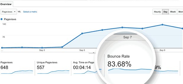
Here are the 8 most effective ways to reduce your bounce rate. With these techniques, you will also improve the user experience and conversion rate of your website or eCommerce. A high bounce rate might indicate you don't have compelling landing pages or have never had one optimized for exploration and discovery. A high bounce rate indicates a problem; something is amiss with your approach.
The bounce rate is a measure of how often people leave your website after their first visit. A high-bounce website could mean you don't have enough content to keep users interested, or maybe the design and navigation aren't user friendly, so they quickly get frustrated with navigating through all those pages, which causes them to leave before finishing their visit (and never come back).
The average bounce rate for this statistic ranges from 26% - 70%. What does "good" versus "bad" look like? Well personally, I believe both numbers can be negative depending on different factors, such as personal judgments, but there may also be positive aspects associated with having some amount higher than average when we look at the purpose of your website or landing page. This is not only my personal opinion. Google has also said the following:
"If the success of your site depends on users viewing more than one page, then, yes, a high bounce rate is bad ... On the other hand, if you have a single-page site like a blog, or offer other types of content for which single-page sessions are expected, then a high bounce rate is perfectly normal."
The architectural design of a website can influence how people interact with it. For example, if you want visitors to remain on their transaction-oriented pages, such as product pages, the homepage might have a higher average bounce rate than other websites, and should be around 56%-70%. A reasonable range is 41% - 55%, but 26% - 40% will always yield better results, as long as there are no technical problems that prevent navigation or loading speed from being optimized.

As I mentioned above, a high bounce rate does not have to be a bad thing, especially on landing pages. Bounce rate is not necessarily a problem when your landing page is designed for conversions - it means that most users are doing what you want them to do. Bounce rate becomes an issue, however, if too many people bounce off the same landing page or website in general.

In certain circumstances, a high bounce rate can actually be an indication of a positive user experience. Blog articles, for example, generate many bounces. If you search on Google for "how to get started with UX," and read a blog post that explains it before you close the page, it is considered a positive user experience. A bounce is fine, in that situation.
On the other hand, if you encounter a landing page and leave immediately because of a huge form, this is an unpleasant experience. If that happens, you need to invest in optimizing the page.
One way to reduce your website's bounce rate is to create a compelling user experience. Bounce rates for websites with poor UX are significantly higher, so it is important to spend time creating a better online experience.
These are just a few simple steps you can take. Now let's dive deep into 8 ways to reduce your bounce rate!
Time on the page metric is calculated by taking into account how long a user spends browsing your website. Google Analytics requires two clicks to get this information, while marketing tools focus more on scroll depth and dwell time, which can help you determine whether something is wrong with site design or navigation flow (ease of use). If bounce rates start to rise in Google Analytics due to recent changes at both ends, then it might be worth looking at these methods below; they will certainly make things smoother again!
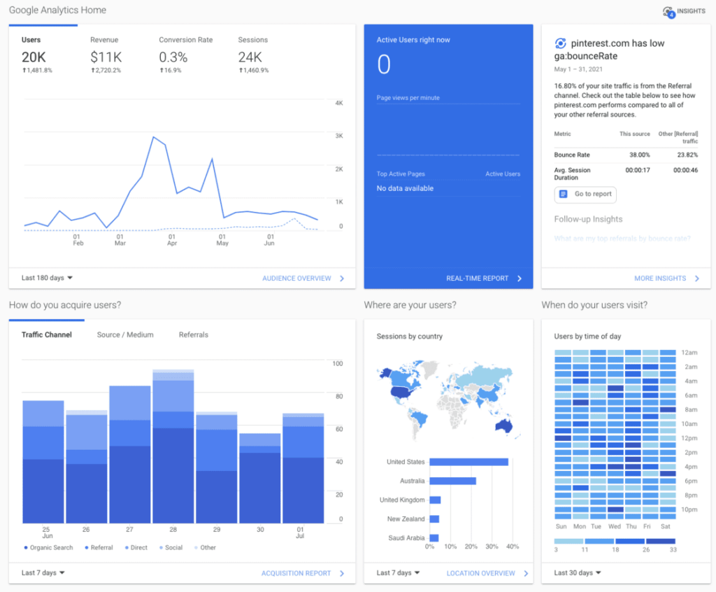
You can't solely rely on the data in Google Analytics to create an excellent user experience. You should always look at different tools that can provide a different insight or angle compared to Google Analytics.
With 54,8% of website visits coming from a mobile phone in the first quarter of 2021, you can no longer ignore this segment of the market (and I hope you haven't, as this part of the market has been above 50% for the last 4 years!). With the growing number of people surfing the web from mobile devices, and Google prioritizing mobile, your site must be optimized for this sort of traffic. A fantastic site design is useless if a website takes a long time to load on a phone, forcing the user to search for alternative sources for what they're searching for.

If your eCommerce website is not mobile-friendly, it will also have a huge impact on your conversion rates. With cart abandonment of as high as 70% on average, you should do as much as possible to encourage users to fulfill their orders and create an excellent user experience for them.
Most people have had the experience of not finding the information they are looking for on a web page, which makes visitors bounce. This is because many website owners do not optimize their site for search. If your visitors do not find what they are looking for on your site, Google and Bing crawling bots will certainly find it difficult to find the relevant content of your site.
Simple steps can be taken to improve the searchability and discoverability of your website or eCommerce. Humans scan websites and digital products in a certain routine, and by following this pattern, you're already on your way to creating an experience that is easy to understand for your visitors. Make sure to use clear messaging, colors with enough contrast, images, and lead the users to where you want them! And never forget to encourage your users to discover more of your content with the help of internal links between your blog post or products.
Another, perhaps more technical aspect, you should consider is schema. Schema is used to optimize for search engines by giving more weight to the elements of the page. The markup allows for increased visibility on Google and Bing, and offers more options for targeting keywords. For example, if you run a clothing store online, you might want to target keywords such as "women's clothing" or "evening wear". This can be done with the right schema that feeds the data about your products, businesses or articles to search engines in chunks that they can understand and easily use to categorize your website or eCommerce.
The importance of search engine traffic cannot be overstated, so some companies pay more than $900 per click on Google Ads. The reason traffic is so valuable is that it has a high intent, which means people who type "blue evening dress" into Google are looking for a particular product or solution to their problem. They are already in the mindset of buying or discovering a solution to their problem, and their intention is strong.
It's less likely that customers bounce if you bid on the correct keywords and provide them with an excellent landing page, since they're more likely to be interested in what you have to say and offer, as it is targeted towards their intent.
There are many reasons why it's important to regularly update your website blog to reduce bounce rate. Letting Google know that you always have fresh and high quality content is an excellent way to rank higher for the search terms you're targeting, but there are also other benefits to keeping your readers' attention with fresh and in depth content! When someone lands on your website to find a solution to their problem, you have already captured their attention. If you've come this far, it would be a shame if they just left your site and never came back, right? This is why you should put in the effort to provide readers with more content to discover with the help of internal links! This will produce fewer bounces and lower your over-all bounce rate.

Some eCommerce product pages use sophisticated and complicated designs, while others are more basic and go straight to the point. All serve to convert visitors into buyers, even though they can vary greatly in appearance! Some companies pay enormous attention to their product pages with A/B tests for different layouts or user experiences - it is often the most important conversion point on any website.

The way you present your product on the Internet is an important factor in whether people will buy from you. A well-structured and impressive page can make all those hours of hard work worth it, but if there are any problems with this crucial part of your online store, customers can simply move on to another seller! In recent years, as consumers, we have been accustomed to truly distinctive experiences when shopping online. Consumers often correlate well-designed and experimental websites with trust. Without the trust of potential buyers, you will likely not get this sale!
You can read more about how to build trust with your shoppers here.
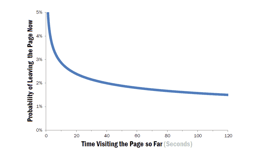
Google says one of the main reasons for high bounce rates is slow page loading times. According to thousands, if not hundreds of thousands of websites, machine learning and behavioral data studies carried out by several research firms have shown that an average mobile landing page takes 22 seconds to load! This has a significant impact on our online behavior, such as leaving before it is finished loading, or simply clicking away when the loading speed is more than 2-5 seconds. This of course has a direct effect on bounce rate.
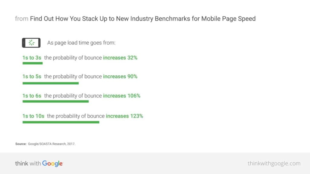
This is not a technical blog post, so I will leave out how to reduce loading speed, as there are too many variables in the equation to tackle this topic here. I would highly recommend studying this field, as it can have a significant effect on reducing bounce rate, as you can see on the chart above. Below you will find some excellent resources on this topic!
Readers tend to click around more when they want to learn more about a topic. If you have a lot of content on your site, you should use internal links to guide them there. This will also help increase the time the reader spends on the site and reduce the bounce rate.

First, you should think about all your keywords and what users might search for to find your content. Then you should take this list and create links to all these content by creating tags, labels or other ways to group pages with similar information. It is also important not to make it too difficult for users to get around by using broad categories such as "retail" or "shopping". These are too general and could be used to connect to larger categories. Instead, you should use more specific terms, such as "men's clothing" or "women's handbags".
You should also consider monitoring broken links of internal and external links. If someone is browsing your website and external links do not work, it will reflect badly on you and your content. It is also wise to ensure that external links are opened in a new tab so that they do not leave your website. You can set external links with a target to be _blank, so it opens separately from your website. This will of course reduce the bounce rate, and I'm sure you can see this effect in Google Analytics.
With this strategy, you encourage users to explore the content you have to offer them, and increase the time spent on your site.
The importance of having an accurate navigation structure on the website or eCommerce store is that it reduces bounce rate and increases conversion. If your websites depend heavily on content and want your users to read more of your content, it is crucial that you offer them a simple way to navigate your website and help them find exactly what content they are looking for.

When it comes to eCommerce, the story is different. Yes, you should offer friendly navigation, but you should also consider not confuse potential customers and giving them too many options. You have to remember that a high bounce rate isn't always negative, and this is often the case with eCommerce landing pages. I used to run a substantial eCommerce store where we sold many different products in the same niche. One of the biggest problems we faced was that when a user came from an ad on Google or Facebook, they almost always went away from the product page or landing pages to explore all the other content we could offer. This is where the use of landing pages that limit outside navigation comes into play! The product page itself should have all the traditional navigation, but a landing page should limit the users options and focus them on the CTA of the page.
Landing pages are designed to capture and keep visitors on your site. The most important cause of a visitor's bounce rate is traffic, which should go hand in hand, as people who come to the page can either stay or leave; that decision is entirely theirs! However, according to Jakob Nielsen, a user experience consultant with over thirty years of experience in this field, there are other factors, such as where someone comes from and their type of personality, that directly affect bounce rate.
To reduce your bounce rate, you must understand who your users and customers are. Bounce rates can be reduced by attracting the right visitors to your website, and that means understanding who they are. You can do this with the help of personas or other methods that I outline in my free workbook. You can get your copy here!
In this article, I have outlined several methods to reduce the bounce rate for your Shopify eCommerce store. In this article, you can also explore other methods and tricks to optimize conversion rates in eCommerce, as these two topics overlap quite a bit.

The reduction of bounce rate all comes down to understanding your visitors, optimizing the user experience and tweaking until you find what works for your website.
Halleljuha! You got through the article 🤩
Bounce rate can be reduced by attracting the right visitors to your site, and that means understanding who they are. The bounce rate can also be reduced with UX design methods, such as reducing distractions on your site or providing clear navigation options for customers. To reduce the bounce rate, you need to understand how your users think - what they want most from their online experience, and why they would leave before they convert (or even add something to their cart). You should also use personas to get in touch with their motivation.
By integrating these principles of cognitive neuroscience into an optimized eCommerce store layout based on personas, you increase customer conversion rates and reduce bounce rate without having to invest more time or money than necessary!