How can you make your user interface designs responsive to different screen sizes?

There are a few key things to keep in mind when making your user interface designs responsive to different screen sizes. First, you need to consider the overall layout of your design and how it will adjust to different screen sizes. Secondly, you need to think about the various elements within your design and how they will resize or rearrange themselves on different screens. Finally, you need to consider the user experience and make sure that your design is easy to use and navigate on different sized screens. When it comes to the overall layout of your design, you need to make sure that it can adjust to different screen sizes without breaking. This means using a flexible grid system that can expand or contract as needed. You also need to use responsive media queries to ensure that your design looks good on all screen sizes. When it comes to the various elements within your design, you need to think about how they will resize or rearrange themselves on different screens. For example, you might want to use a different font size on smaller screens, or you might want to rearrange the order of your elements on larger screens. You also need to make sure that your buttons and links are big enough to be easily clicked on different sized screens. Finally, you need to consider the user experience and make sure that your design is easy to use and navigate on different sized screens. This means making sure that your menus and navigation are easy to use on all screen sizes. It also means making sure that your content is easy to read and that your forms are easy to fill out on different sized screens.

CRO & UX are a big field, it can be difficult to know where to start 🤔

Most of the guides out there are either too long, too short, or generalize things so much that they do not help you at all.

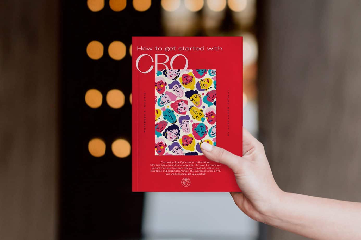
My free workbook will help you create your own plan for CRO success by showing you how other companies have done it successfully and what went wrong with their strategy to learn from their mistakes. The book is free, as I believe knowledge should be shared! The book has already helped several companies.
Radahl.no logo
RÅDAHL is a leading eCommerce and UX design company with over 12 years of experience in the industry. We have a unique perspective on how to approach new ventures in eCommerce and state-of-the-art technology, and we are skilled in problem-solving and understanding the needs and motivations of users. 
2022, RÅDAHL BENZ. All rights reserved.
crossmenu